My Problem with "r"
Somewhere along the way I lost all confidence in writing the lower case "r". To mask the trepidation I would feel as I approached a word with an "r", I began to replace a lower case "r" with a smaller version of an upper case "R".
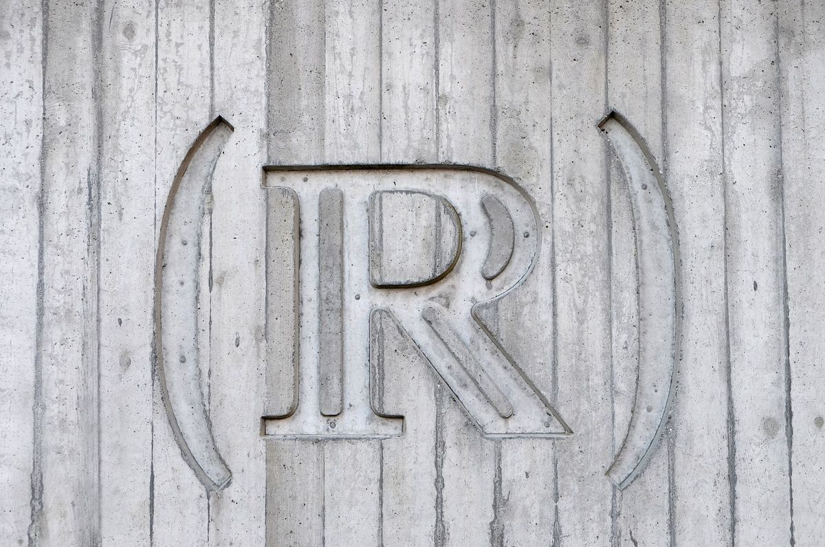
Somewhere along the way I lost all confidence in writing the lower case "r". My "r" might look more like an "n" or a "v". Sometimes an "r" might lack the left top, consisting of a simple curve to the right, like a tilted parenthesis, nearly a "c". Or worse, just a bottom-left to upper-right slash.
To mask the trepidation I would feel as I approached a word with an "r", I began to replace a lower case "r" with a smaller version of an upper case "R". I made this switch so often that it became habit, allowing me to write at speed, easily substituting all "r"s with "R", giving it little conscious thought.
Of course I realized this was all foolishness, for when I put my mind to it I could write the most beautiful "r". One with a clearly defined stem and a gentle, consistent curve to the right ... and yet this lack of confidence persisted.
I'm spending more time writing with pencil and paper these days, and with this process I've vowed to tackle my "r" fears. I've found that it helps to keep the lead sharp, providing more opportunities for a clearer definition to the shape of the letters.

There are 73 "r"s or "R"s in this article.
I mistakenly wrote 6 upper case "R"s where I should have written "r".
0 of them look like "n".
12 of them look like "v".
16 of them lack the proper stem.
4 of them look like a slash.
It is clearly a work in progress.
Now I've noticed that sometimes I write the letter "t" with a curl to the right, like a backwards "j" and sometimes I don't ... hmmm ...
[The initial draft of this article was written with a well sharpened Switzerland made Caran D'Ache Yellow School Pencil - HB]